|
|
Elite Veteran
Posts: 963
  
Location: San Antonio, TX | Ok, at first I dismissed it as me being just too picky. But my eye kept getting drawn back to it. The letters on the back of my car aren't even. The middle letters are definitely lower than the ones on the ends. So I'm getting annoyed thinking my car was Monday car or the worker that drilled the holes had a hangover. Sigh. But you know what my hardtop is the same way. Just looks wrong to me but i'll get over it.
 (backletters.JPG) (backletters.JPG)
Attachments
----------------
 backletters.JPG (63KB - 128 downloads) backletters.JPG (63KB - 128 downloads)
|
|
| |
|

Expert
Posts: 3967
 
Location: DFW, TX | Those letters are on a bulbous part of the trunk lid. What looks "weird" while directly standing above it with a straight edge may be visually perfect from the car sitting behind you at a light.
Did you also notice that your trunk letters are not all the same size, and they don't have the same font 'padding' either? Notice that the "S" is much closer to the center than the "O". That's intentional. The designers were trying to achieve visual balance, not scientific precision. If they were all spaced evenly, the 'DES' half would appear crowded and the 'OTO' half would appear sparse.
|
|
| |
|
Expert 5K+
Posts: 9904

Location: Lower Mainland BC |
We've been around (and around) on this topic before. 
I think the bottom line is the letters are arranged to be parallel to something that is curved and therefore, not in a straight line.
Some examples:
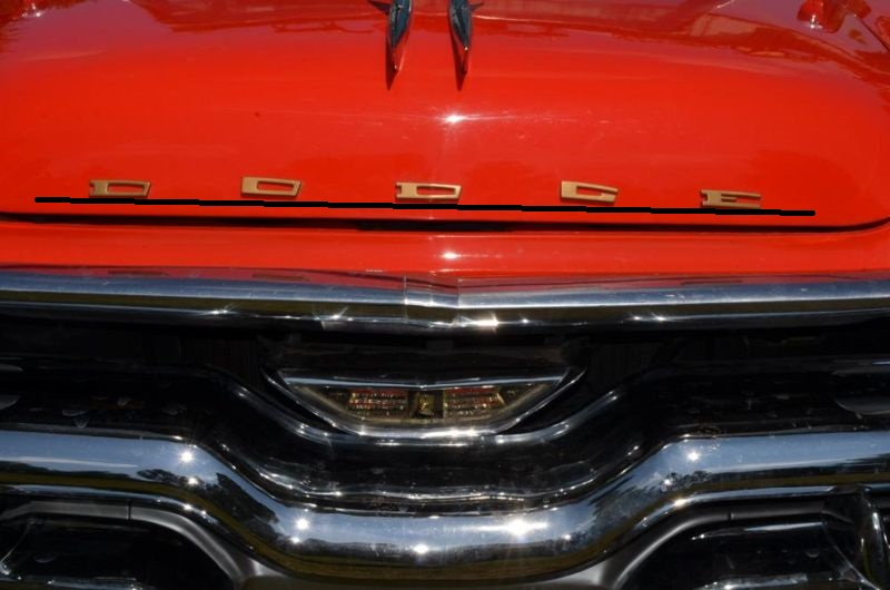 (57D501HoodBadges.jpg) (57D501HoodBadges.jpg)
Attachments
----------------
57D501HoodBadges.jpg (84KB - 129 downloads)
|
|
| |
|
Elite Veteran
Posts: 963
Location: San Antonio, TX | I'm not the best on the art part... need to channel my feng shui I guess |
|
| |
|
Elite Veteran
Posts: 963
Location: San Antonio, TX | Stood back a bit and admired the perfection of art. Looks great. |
|
| |
|
Expert
Posts: 3967
Location: DFW, TX | Truly, about as artistic as cars ever got! |
|
| |
 57 De Soto back letters

